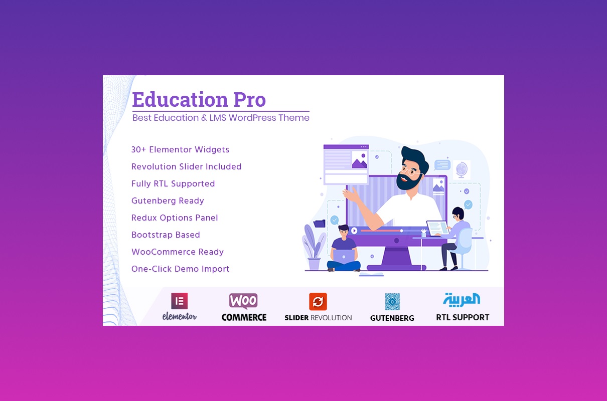
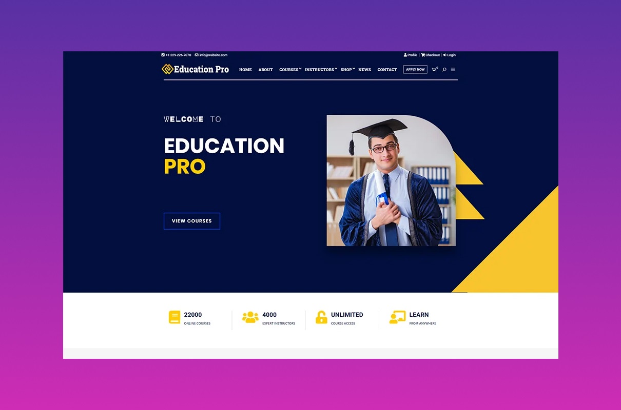
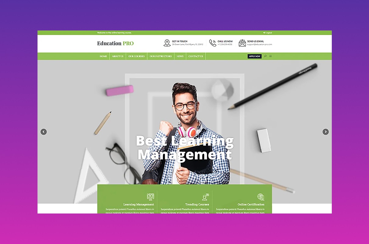
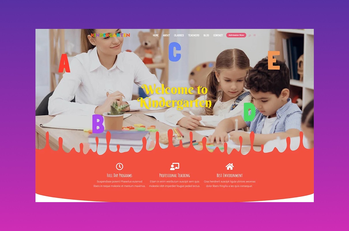
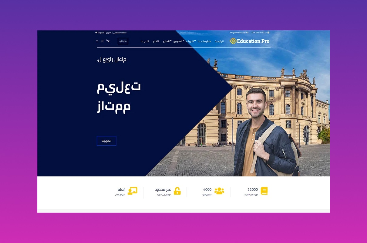
Education is a treasure that every person needs. It is a tool with the help of which we acquire new knowledge and skills, enrich our worldview, and evolve. We commonly receive education from universities, colleges, and schools. However, there are still online structures, educational courses, academies, and other platforms where it is quite possible to gain knowledge. It is cool to enrich your inner world without leaving your home. Modern technologies that rule the world these days are happy to give you such an opportunity. To use this, you need a website. Try a template to develop it without spending extra money, time, and effort. The choice is wide on the Internet. There are universal and themed HTML and WordPress models customized for a store, blog, and many others. In this field, we offer you the best. It is Education Pro.
Key Features of Education Pro WordPress Theme
Functionality is necessary for any sample. It is essential to carefully evaluate the available options before buying. Choosing clothes, you pay attention to the material, structure, color, and size. The same here. If you want a learning platform, your model should have a good menu, сustom widgets, a WooCommerce option, and other functions. More details are below.
Redux Framework
Usually, we use the settings page or the admin panel to configure a sample for a website. The whole process of creating a web resource is complicated. However, you have the Redux Options Framework; this tool completes your work easier. When we buy a template, we immediately want to adjust its appearance. It is what attracts you and your customers the most. Customize it according to your brand and personal preferences. The best part about it is that no coding is required. There is no need to worry if you have experience in this.
The interface is user-friendly and intuitive. It helps you to navigate the functions quickly. Use Options Frameworks, a library with many ready-made codes and plugins. So the appearance transformations, but the code does not change. Upload logos, and adjust the color, shape, background, cap, layout, button, collage, or another element. You have access to various topics. Also, add JavaScript or CSS and so on. Redux is well-known and popular.
Another of its positive features is simplicity: creating an object and starting to work in Redux is easy. All documentation is available on the website. There are also video lessons. Developer documentation, such as the knowledge base and codex, are well formed. The community around Redux is amazing. Have any questions? Reach out to them. There is always someone who has faced such a problem before. You are being taken care of, and that is good.
Revolution Slider
The decor is extremely important when creating web resources. Sliders are among the most popular elements developers like adding to their pages. It is not surprising. They beautify any page. Meet the powerful product from the ThemePunch company. Slider Revolution is your chance to spoil your users with unique content. Show videos and photos with and without captions with their help. There are a large number of transitions, both simple and high-tech, such as a 3D transition.
Here are some of the benefits this plugin gives you:
- resize elements;
- add as many layers to descriptions as you want;
- the jQuery library;
- the Easing function (assembles the animation more realistic by fixing the speed of movement);
- supports YouTube and Vimeo;
- autoplay and full-screen mode;
- carry out actions with drag and drop;
- interesting effects, such as a shadow;
- duplicate slides, signatures;
- hide the slider if possible (if it allows screen expansion).
Use a variety of fonts. It is possible to combine or separate signatures (it depends on the slider’s width). With this plugin, your web resource is equipped with the “start and stop”, and “next and previous” buttons. The ability to go to the previous is also included for your customers.
Education Pro supports bbPress
The forum is another thing that you can have on Education Pro. The essence of this type of activity is to discuss different topics. People communicate in real-time, express their thoughts, share impressions, and more. It’s like a club of interests. That has an impact on search engine optimization. Visitors come to such a site not only for your product but also for other purposes (looking for answers to questions). You don’t need to care about the material; the content authors are people. It is a good way to increase the number of visitors.
The forum is a source of information for buyers and an effective way of providing feedback. Advertise your services here. In response to users’ questions, tell more about training courses, online school, etc. Society’s attitude towards such web resources is changing: trust and loyalty to the company are growing.
Students receive many benefits from this; for example, they may:
- express oneself;
- share experience and knowledge;
- have a good time;
- help someone or get help yourself;
- get to know someone and find like-minded people.
A few more unique features that add attractiveness to your site
- With Retina Ready, neither you nor your clients have problems with a high-quality picture. Your project looks clear and bright on the screen.
- Compatibility with WooCommerce. It’s like this: if you’re involved in e-commerce, you’re dealing with WooCommerce. This platform gives you a chance to sell any product with style.
- Change any parameters. Customize the layout of your project to your taste. You accomplish this without any intervention in the code. Publish and then modify articles, descriptions, images, and other elements. If you don’t like the color, adjust it. The choice is wide.
- Preview. Useful quality when creating web resources. Make sure you are moving in the right direction. Click on it, and you will see what your site looks like with your edits.
- Responsive design is a must for any modern sample. No one uses a computer anymore to get into a desktop computer. Phones, tablets, laptops, all these are an integral part of our lives. Your work is displayed in the best way on all devices.
How To Make Your Education Pro The Best?
The online education market is worth more than $315 billion. And this number is constantly growing. Here are some tips from us.
- To begin with, analyze the current services. Improve yourself and your business by getting to know your competitors. Learn from the mistakes of others. Find their weak points and avoid such problems on your platform.
- Define your audience. A constant flow of clients constructs a successful web resource. Explore social networks such as Facebook, LinkedIn, Medium, Quora, or Reddit forums. In this way, you predict the demand in this area.
- Make an interesting offer. Describe what you provide to your customers. It can be a certificate of completion of courses, a portfolio with results, help in future employment, etc.
- It would be cool if you had your brand. A well-known company promotes trust in your company. People identify you as an expert in your industry.
- Choose the project format. With the Education Pro WordPress theme, it is possible to upload lectures, webinars, lessons, podcasts, audio, and other elements. Please choose one or combine them. Take care of student feedback, homework, and class schedule.
- Arrange a payment method. There are several options here. For example, let buyers pay for access to materials or a subscription for a certain period (weekly, monthly, or annually). It may also be a one-time payment, after which a person receives unlimited access. Promotional offers positively affect buyers: create special package offers, organize a rate draw, etc.
Remember, a perfect project may not turn out the first time. It is not easy to accomplish it on your own. But with our template, you put in less effort. With us, chances are that your project will shoot more. Our advice helps to assess perspectives and adjust the material to the student’s requests.
Logo Design Trends Video
You must have a logo. There are text, graphic and combined logotypes. Pick any. It should be concise and easy to remember. Make sure that it looks harmonious on your website. You have to be modern to impress your client. Rate the logos of competitors. Do not repeat them; come up with something creative. Education Pro offers a wide range of fonts. Remember, handwritten fonts look beautiful but are difficult to read. Watch this to find out what the trends are right now.
Project Info
- Date:12.6.2022
- Client:THEME_X
- Categories:WordPress
- Tags:Books, Education
- Buy


