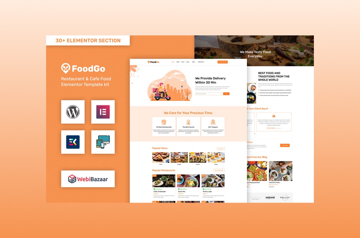
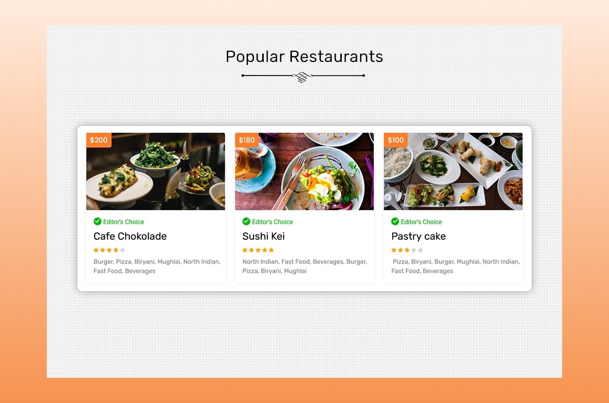
Nowadays, we cannot imagine our life without food delivery. We order from restaurants and cafes online for work, home, during holidays or corporate events, to the park, etc. We use it daily, so it’s cool to have a business related to it. Even though such a service is available in almost every city, the demand for such activity is growing. Many companies order delivery during the lunch break. It is worth noting that this is a regular income for you. You also operate such favors if you have unexpected guests and have nothing to feed them. Also, it is necessary for people with a fast pace of life. To meet all these people’s necessities, you must develop a website. The FoodGo WordPress theme will certainly help you with this. It is a gorgeous sample presented by the company Template Monsters with special features that amaze every visitor.
Key Features of FoodGo WordPress Theme
To make sure that this offer is perfect, try the live demo. The functionality available to you is impressive at first glance. With a cool and modern web resource, you have all the chances to be the best in this field. It’s cool when your creation is multifunctional and therefore interests many purchasers. Parallax, major browser compatibility, testimonial slider, clean code, fast performance, and other advantages are supported.
Full responsive design
In this business, it is necessary to have a mobile version of your page. These days, it is common for all daily online activities to be accomplished through a mobile phone. Previously, everyone focused on stationary computers. Nowadays, our whole life is on the mobile phone. There are different devices with different screens. Therefore, It is not required to create a design in pixels and only for desktop computers. The FoodGo adapts to any screen size, so your customers see the best picture on their laptops, tablet, smartphone, or other gadgets.
Breakpoints assist in changing the location of various sections and blocks. For example, if the material is presented on your website using three columns, it looks like this on a computer, but there is only one column on a smartphone. Responsive design usually assumes a long time to develop. You ought to find good specialists who may design an excellent view for devices with different screen sizes. In addition, this is not a cheap pleasure. After weighing all the pros and cons, we understand that choosing a sample with this function built in is better for you.
Statistics show that if purchasers require to find information or order a service, they utilize their mobile phones. Moreover, people usually accomplish it at home or work. It is important to point out that these places mostly have stationary computers. Despite this, we choose mobility. Clients will leave you choosing your competitors if your site is not responsive. All your content (texts, GIF files, photos, and videos) is prepared for all gadgets.
Nicely prepared interior pages
The correct site structure helps to provide services conveniently. In addition, it is easy to operate. Your customer should carry action intuitively. It bears less time then. It also affects SEO because the online resource is promoted with the right architecture. Construct your web resource clearly and logically. Everything must be thought out. If the buyer cannot quickly find the material they need, they close the link and move on to the next one. Monitor the behavior of visitors to your project. Purchasers stay on an attractive service and become regular clients. A constant audience assembles a considerable income.
It is not necessary to waste your time creating each section separately. Our team has already taken care of you. That is why our creators developed the following departments:
- About us. Introduce yourself to your client. Tell how it started, show the team, add a photo, and post interesting stories about your professional activity. All of this brings us closer. It is better to cooperate with a company with a pleasant atmosphere.
- FAQ. Such a section saves not only your time but also buyers. Tell us about services, delivery, payment methods, the advantages of working with you, etc.
- Favors. Such a list is mandatory. After getting acquainted with it, purchasers decide what they want.
- Contact. In this way, all those who wish to contact you. Leave several options for communication: phone numbers from different operators, e-mail, addresses, links to social networks, and related canals.
- 404. We are all familiar with this “incredible” number. The feelings that come over us after seeing are not pleasant. Try to change it. Add a funny picture or some joke. A sense of humor is relaxing; take advantage of it.
Here are a few more reasons to buy our layout
The FoodGo looks incredible for several reasons.
- You have access to FontAwesome and Google Fonts. Choose beautiful fonts for texts, descriptions, posts, headings, and logos. Please don’t overdo it. Choose 2 or 3 different ones. But make sure that they are combined. Keep your project clean and aesthetically pleasing.
- The ability to leave feedback is also essential. Testimonial Slider assists you manage your testimonials. Feedback mockups look great. In addition, they are responsive, so they look perfect on all gadgets. Adjust the color, style, margins, and other parameters.
- With the help of standard pagination, you divide large volumes of information into parts. That affects speed as well as navigation.
- The animated effects construct your project more interesting. The dynamics always fascinate the viewer. Such sites are remembered, making it easier for people to return there.
- Social media buttons allow you to advertise for free. If the product or information is interesting, the person shares it with friends, relatives, and others. This way, your online resource gets on Facebook, Instagram, Twitter, or other networks.
- The developers have created a page for the menu. See how it looks in the demo. Please add the names of dishes or products and photos of them. Do it so that the clients drool after seeing it. Descriptions of plates should also be tasty. You have a pricing table section at your disposal. Set up a shopping cart, checkout window, loyalty program, and other options.
Enchanting Content For Your FoodGo WordPress Theme
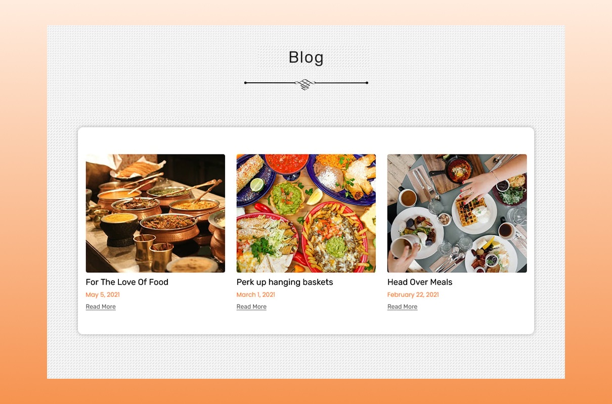
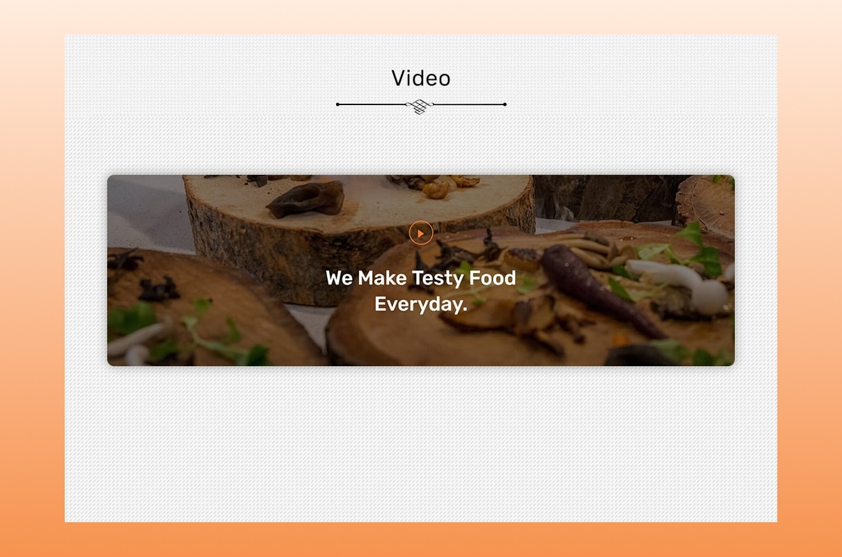
A blog attracts traffic to your online resource. It is most useful for food delivery owners. Because in this way you may talk about your product in more detail. Publish delicious recipes, dishes reviews, and videos with a cooking guide. Write about the benefits of beans or the harm of soda water. Dietetics, organic food, vegetarianism, kitchen utensils, and other topics are always relevant. Add content constantly. You always have new material on the site if you accomplish this regularly.
Each text has additional keywords. Search engine optimization operates. You climb higher in the search engine and overtake your competitors. The greater the variety of topics, the more buyers. Now you get leads from direct food delivery requests and other requests related to nourishment.
Advertise your favors by writing a new text. A blog shows the company’s competence, so you increase your confidence. Your posts appear in public and on personal accounts on social networks. That means more readers of your blog. By publishing informative articles, you increase loyalty to the company. Write about new products to increase the number of sales. We all love the material for entertainment. This kind of content is also required. It is easy, and people often share it on the network. If you do not know what to write about, look for information on the Internet. Everything is there. Plagiarism is prohibited online, but creative and modern portals inspire. Watch videos on YouTube, find accounts of famous humans or bloggers in this field, etc.
Web Design Inspiration For Your FoodGo WordPress Theme
You may use any font from Google or FontAwesome for your website. Typography is an important part of web development. It affects the visitors’ emotions and motivates them to take advantage of your favors. Organize your material to be easy to read. No need to complicate it. Remember, simplicity is your best friend here. Everything has to be clean and harmonious. Template Monsters and their YouTube channel help to follow trends. Go through the link and be the best.
Project Info
- Date:11.15.2022
- Client:WEBIBAZAAR
- Categories:WordPress
- Tags:Food
- Buy


