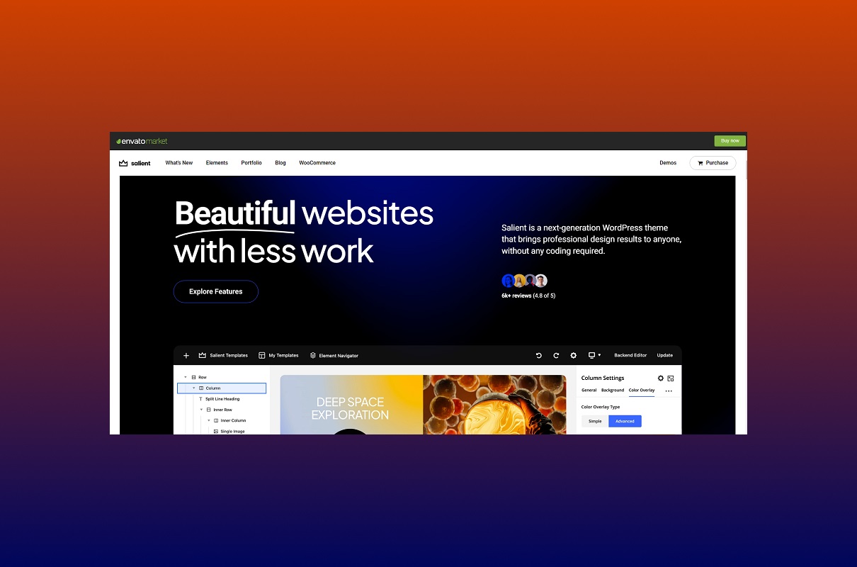
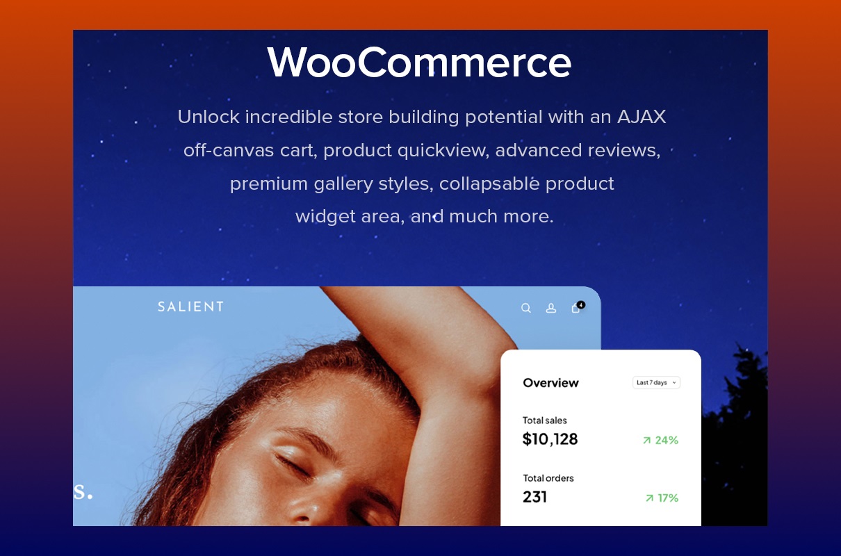
These days, you can’t imagine any business without a good website. To save money and time, you may buy a ready-made website template. There are a large number of platforms that offer a huge variety of samples. You must be interested in the appearance of your site’s internal functions and capabilities. It is a good option because, with the Salient theme, you will get a business with many cool features that will help you develop your business.WooCommerce is one of the best customizable platforms for your eCommerce company. If you want to start selling online but don’t know what kind of products or services to sell, it is necessary to buy a universal layout. Or another case. You are already a successful entrepreneur with two or more businesses and need a multitasking template to manage your websites simultaneously. In all these cases, we will help you. It is a great multipurpose sample for quickly creating the development as you wish.
Key Qualities for Multipurpose WooCommerce Salient Theme
User-friendly Design
Naturally, you want to create an adored first impression. You can perform it with our model. Your online resource is your face, take care about looking good. The interface is intuitive and understandable. You should not have any special knowledge. You modify all settings easily. The pattern equipped the popular visual composer named WPBakery page builder. This technology has a lot of advantages, such as
- Installation on personal hosting
- Work on 99% of topics;
- Front End editing (research, writing, editing, atomizing, design);
- Back End editing (control of incoming new information, posts, media, settings users, plugins, tools, configure various options and solve different problems from the dashboard area that is the backend);
- Template library;
- Adaptive design;
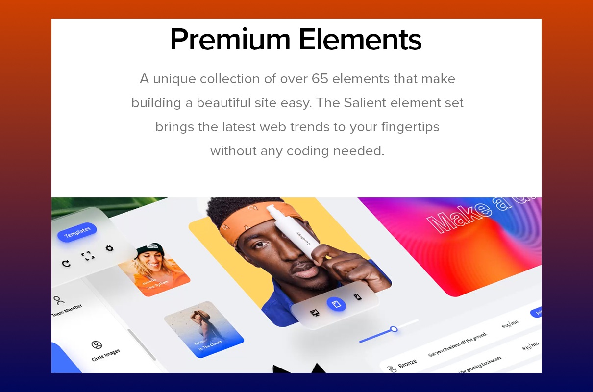
- more than 40 + elements + installation of addons (Addons);
- Using Bootstrap Grid.
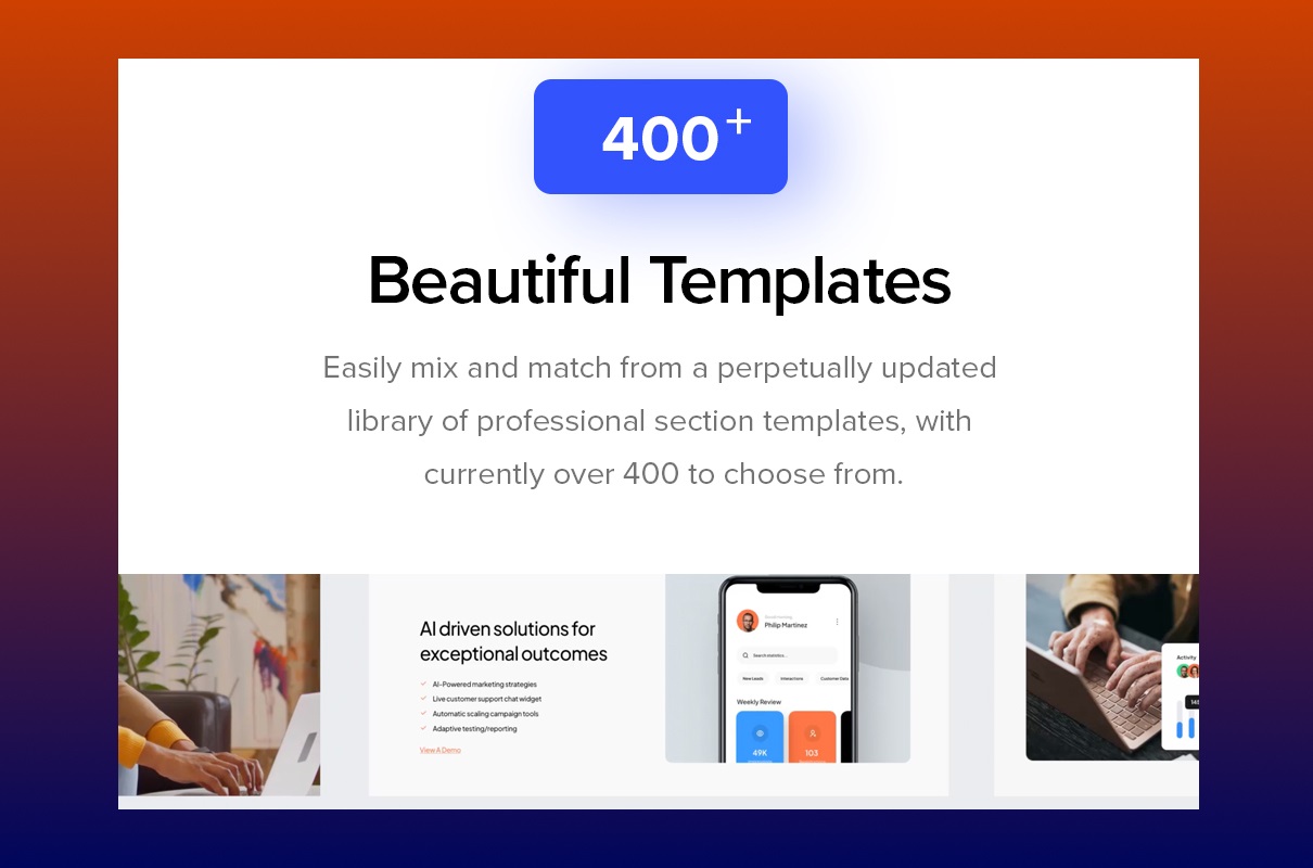
You have beautiful visual settings which have been improved for more convenient use. Our interface forces visitors to stop and stare. Our designers worked hard on it for over seven years. It is very important to be attentive to details. Focus your attention on the quality of your product. A huge package of premium layouts library is available. ThemeNectar developed it. You deserve the best. Modify each sample directly through the page builder. Content structuring allows you to change any options easily. That is why more than 350 carefully designed models are placed in 15 separate sections. It improves navigation on your online resource. It saves your time. First, you select the category, then the model which you wish. Moreover, you may mix and unite two or more different layouts. With this amazing possibility, you build something one-of-a-kind. Also, Unplash developed a lot of placeholder pictures.
Ideally suited to any website
The salient theme is a multipurpose site. It doesn’t matter what you want to see on your resource. This layout is perfectly suitable for all your ideas. In addition, they created pre-built pages in different categories, such as
- “Wellness”. Here you can write about health, nutrition, fitness, lifestyle, clinic, spa, obesity, superintendent, gym, food, and so on.
- “Architect” is a trendy model with clear ling transitions. You can put a lot of photos here. Write about building towers, gothic castles, the works of Antoni Gaudi, Frank Owen Gehry, and Richard George Rogers, the restoration of buildings, and other things.
- “Resort” is the best solution to post articles related to traveling, parks, vocations, gondolas, golf, casino, hotel, Disneyland, Aspen, or the Maldives.
- “Band” here, you may add a schedule of tour dates, the history of creation, a list of albums, videos from concerts, advertising of future performances, news, social networks, and links for listening to songs on global platforms like SoundCloud or iTunes.
- “Startup”. If you have an idea for a startup, you need to have a cool website. Tell your store, tell your opinion in more detail, share promo video and main documentation, and add statistical data (Everyone likes numerous).
- “Restaurant”. Restaurant enterprise is among the most popular types of entrepreneurial activity. Developers have produced many sections where you can post information about the work schedule, menu with prices, gallery, reviews, contact data, social media, and others.
- Layouts for a corporation, electronic commerce, and magazines are included too.
Ultra responsive design and retina ready
Your recourse should be useful. Customers want to have the possibility to open your creation on any gadgets. It is cool for you because if your web resource looks good on any device like a laptop, mobile phone, smartwatch, MacBook, or stationary computer, the client’s flow increases. That leads to the achievement of the main goal of the resource, namely increasing profit. The visitor presses on your link and automatically receives a perfect picture with the proper size. It is necessary to have this function. That allows your customers to see your information anywhere without a problem. Cascading Style Sheets and HTML assist you in hiding unnecessary sections, enlarging or shrinking your work, and doing everything possible for customer satisfaction.
The option of responsive images is available. Visual content is important too. We want to see photos of high quality regardless of resolution or screen size. These and other features should not interest us. This process allows you to improve performance across different gadgets. Generate your site fully accessible, it helps you be among the best competitors on the market. The Apple company releases all its devices with the Retina Ready option installed. The innovative process does not stand still. It is constantly moving and developing. Higher screen resolution is continually increasing. With this, we establish tough material with high-fidelity text and beautiful photos. But the best needs the best. High-resolution content necessitates high-resolution displays. After that, sites load longer. Nobody likes to wait. If the resource downloads too long, the client goes away. But the Salient theme is blazing fast:
- 93% YSlow Score
- 97% Page Speed
It was data from a service that analyzes the speed of loading online resources (GTMetrics).
Help Center
We take care of maintaining our site. Our team developed a place where you may ask any question that interests you, receive the answer and solve all your problems. We produced the center to make your experience easier. They established a well-organized online resource with easy navigation and simple searchable material. Such centers often include an FAQ section. Thus, you have access to the information you need, and you shouldn’t contact the service team. That saves not only your time but the team’s time too, receiving more opportunities for customer service to focus on more important matters. You also should have the same center. Nowadays, clients want to be tech-savvy and acquire solutions to request for themselves without extra talks. Usually, most of the requests from visitors are repetitive and standard. Save your precious time, and build a help desk that will improve your customers’ self-service.
Every possible option
Salient Page Builder is equipped with many fantastic attributes. You have a lot of sections, and you have a chance to fill all of them:
- Portfolio (great opportunity for photographers, models, architectors, actors, and so on)
- Recent project (show what you have already done and what your achievements are; share a few previous projects to convince the client to buy your services)
- Blog ( open your ideas and thoughts to the world. Vlog is a good opportunity to increase the number of visitors. People will be able to share information, and you will be able to distribute your development without advertising)
- Icon (We contain four icon boxes that form one of the complete icon packs on the ThemeForest, including Steadysets & Linea, Icon Minds ($59 value), and FontAwesome)
- Video Lightbox (so cool option. You have a plugin that allows you to insert videos on your work with the help of a lightbox overlay display. Demonstrate videos from Vimeo, Flash, iFrame, YouTube, etc. In addition, inserted videos are visible on other devices such as iPads and iPhones)
- Interactive Maps (you have incredible opportunities to produce interactive maps. Demonstrate any regions, counties, or continents. You may show office locations, travel maps, project maps, statistics maps, or anything else. Features: color counties and regions, set click actions, as an open new window, change initial zoom and center, add legend vector markers and icons more and more)
- Product Quick View (if you have your eCommerce store built by our model, you have such a function. Just hover over the product, and you will get more detailed data about it)
How to choose a proper theme?
Choosing the layout is a big decision. The success of your business depends on it. Firstly, you should think over about:
- How much are you willing to spend on it?
- What features are required?
- Do you have any experience in that?
- Can you install the template yourself without any help?
You will be surprised by the number of different and charming patterns on the market. And it is quite natural. We put together all tips to make your choice proper. See below.
Make up your mind about what kind of website you want to create.
Do you need a simple one-page website (a literal development with 1 page where we can’t see navigational links), or is it necessary to have a few chapters with maps, portfolio, blog, and so on? The sample should correspond to the field in which you work. If you are an architect, the pattern produced for restaurateurs will not suit you.
Also important is which type of sample you prefer. Please pay attention to these elements when it comes to ordering the proper pattern.
- Header Pattern. The header is an important part of your development. The first thing your customers see is this element. There are a lot of options for how your title will look. This element may contain pictures, slideshows, videos, etc. Or you have the opportunity to add a simple image with a logo. Your sample header should include two things. The first one is attractive appearance. Hire a professional for this. And second, it should message the visitors about the main goal of your business. Unite the image with text if your activity is hard to explain. Share a slideshow if your company gives a few services or you serve different audiences. It is a good way to demonstrate what you offer to your customers in an organized format. Adding video is a powerful marketing instrument that assists you in explaining your goal clearly and helps your buyers to feel their importance.
- Prominent logo placement. Place your logo near the navigation panel or the center of your online recourse. In the first case, it fits you if you focus more on your goods and services than branding. For example, you are the owner of a B2B business. Choose a centered logo if your company’s brand identity and popularity play a more significant role. For instance, it is popular for retail enterprises.
- And one more, content width design. There are two variants: boxed width or full-width. The visible frame to the left and right is characteristic of the first one. Business companies often choose this type because that seems more professional and traditional. Or another way is when the background image stretches the full width of your monitor. It is more modern and creative. Please pay attention to our layout has a perfect full-width design.
Customization and Functions
A Salient theme is ideally suitable for any enterprise. This sample has a lot of advantages. Your work should improve the website, not the other way around. Please don’t overdo it, сustomize your website carefully. Our model contains a wide variety of colors and fonts. Add multimedia, make collages, or other options that our sample proposes. Try to discover all functions. After researching all, choose only the one you need. No inappropriate material in your chapter. Only what is necessary. Remember about customer support. It is cool to have the possibility to add this function to your creation.
Navigation of your online resource is important too. With this component, your buyers move around the site. Provide it so that they perform it quickly and easily without any effort. Let your work bring only positive emotions. No disappointments. No dissatisfaction. Our team presents you with more than 50 unique elements for page builder and more than 3 500 admiring icons. Navigation of your recourse should be easy to use and clean, pleasing to the eyes. The key departments must be arranged in order of importance. The DropDown menu is welcome. The position of your navigation panel is also essential. Most people are used to the classic variant, horizontal navigation on the top. If there is too much information and visitors must scroll to the bottom for a long time, the main menu must be frozen. You must include an attractive appearance, appropriate features, responsive design, normal speed, and SEO optimization. Only a positive impression should leave your company. This way, people will come back to you again and again.
Top Website Models for Your Business Video
WordPress is one of the famous content management systems that give you a world-class support team, free hosting, your domain, and much more. It would be best if you discovered a huge collection of WordPress templates and new functions and options represented by WordPress 6.0. Click here and enjoy watching it!
Project Info
- Date:08.30.2022
- Client:ThemeNectar
- Categories:WordPress
- Tags:Business
- Buy


