Every brand has its style and personality. And the colors and fonts they use are essential to creating that image.
Choosing the right color scheme for your website is a complicated and essential task. Different colors evoke different emotional responses, affecting your website’s conversion rates. You can’t just pick any colors and assume that they’ll work together. It would help if you had a coherent color scheme to create a harmonious design. This article will answer all these questions for you and provide a few examples of how other companies have used color and font to create their unique brand identity.
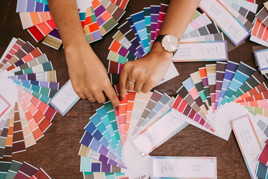
A website color scheme refers to the overall color palette used on a website. It includes colors such as blue and red, which are generally associated with websites template that send an institutional or corporate feel, and other colors such as green and cyan, which tend to evoke a natural or horticultural feeling. A cohesive color scheme will feature colors that work well together, while different shades of the same hue can make things appear more professional
Color Theory in Design
Color theory is a study of how colors interact with one another. Color theory is important in design because it helps designers to create harmonious color palettes.
A color wheel is a tool that designers use as a guide when they are trying to decide which colors work well together. The primary colors are red, blue, and yellow. The secondary colors are green, purple, and orange. Tertiary colors are made by mixing two secondary colors: red-violet or blue-green. The color wheel is used to determine the colors that go well together.
Font Pairing Guide
This guide will help you choose the right fonts for your content.
Many factors contribute to the success of a font pairing. That is why it is important to consider them before choosing a font for your content.
The first thing to think about when choosing fonts is whether you want them to be similar or not. For example, can Batangche Font be paired with Helvetica fonts or not. Similar fonts work well together and create harmony in an article while contrasting fonts can make your content more interesting and engaging.
If you are using two different serif typefaces, ensure they have similar x-heights and that the serifs on one match the other serif typeface’s serifs as closely as possible. When using two sans-serif typefaces, make sure they have similar stroke widths and weights (boldness).
When combining two scripts, it is best if one is cursive and the other has more block lettering because they will complement each other.
Key Elements to Consider When Choosing a Color Scheme for Your Brand
The color scheme is the most important and difficult decision in creating a brand. It can be the difference between an average and an excellent brand.
Here are some key elements to consider when choosing colors for your brand:
- What colors reflect your personality?
- What colors do you associate with your industry?
- Which colors are most representative of your target audience?
- What colors are trending in design right now?
- Do you want a cohesive color scheme or one with more variety?
How to Choose the Right Color Palette For Your Brand
Choosing the right color palette for your brand is crucial for any business. It can help you convey the right message to your customers and make or break your brand image. There are many different ways to choose a color palette, but there are three main factors to consider:
- The tone of the colors – cool or warm?
- The saturation level of colors – bright or muted?
- How do colors interact with each other – complementary, contrasting, or neutral?
What Makes a Good Font Pairing?
The first thing to consider is the type of font pairing. There are three types of font pairing: monotone, complementary, and contrasting. Monotone means that both fonts in the pairing are similar in style, size, weight, and so on. Complementary means that one font is a serif and the other a sans-serif. Contrasting means that one font is bold while the other is thin or vice versa.
The second thing to consider when choosing fonts for branding is how they work together in different sizes. Fonts will look different depending on their size because they have different proportions. For example, some fonts have thick strokes while others have thin ones, so you need to ensure they will still look good when they are small or large.
When choosing fonts for branding, the third thing to consider is how they work together at different weights (light, regular, bold). The font’s weight will also change its appearance depending on its size. For example, the weight of the font will appear much lighter when it is at its smallest size. Choosing fonts with similar weights will create consistency in your design.
Conclusion
In this guide, I have given you all the information you need to choose colors and fonts that will work well with your brand.
Understanding color psychology can help you understand how colors affect people’s perceptions and behaviors. Contrarily, fonts aid in developing a distinct brand identity that the audience can recognize.
Key elements in raising brand awareness are colors and typefaces. They must successfully convey the personality of your brand. If you don’t do it correctly, your brand’s potential may not be realized to its fullest. We hope these tips will help you decide on the color schemes and typefaces that will make your branding efforts successful.


2 Comments