Understanding the people you made your site for is the key if you want it to be successful. So, let’s go over design psychology: the intricate connection between user behavior and web layout!
Unveiling Design Psychology Basics
At its core, design psychology explores the connection between user behavior and web layout. By understanding the principles, you can craft web layouts that resonate with visitors. So, design psychology will help you create a noteworthy online store. Implementing these concepts optimizes reader experiences, fostering trust and encouraging conversions. People are also more inclined to investigate your offers and make purchases when they are at ease and engaged. So, in order to influence behavior in ways that are advantageous to your online business, you must know design psychology.
Visual Hierarchy: A Key Factor
Visual hierarchy is crucial to the connection between user behavior and web layout, influencing how people navigate your site. You can guide their gaze and direct their attention to key information through a strategic arrangement of elements. So, by placing important content prominently and using contrasting sizes and colors, you can create a clear pathway for readers to follow. This not only enhances the reader’s experience but also drives desired actions. For instance, a well-designed visual hierarchy on a business website can lead visitors to your contact details or call-to-action buttons, prompting them to initiate communication. As such, this can even help you with optimizing your website for more phone calls so you can make connecting with clients easier! People are more likely to engage and convert when they quickly locate what they’re looking for!
A grid system’s ability to build layouts
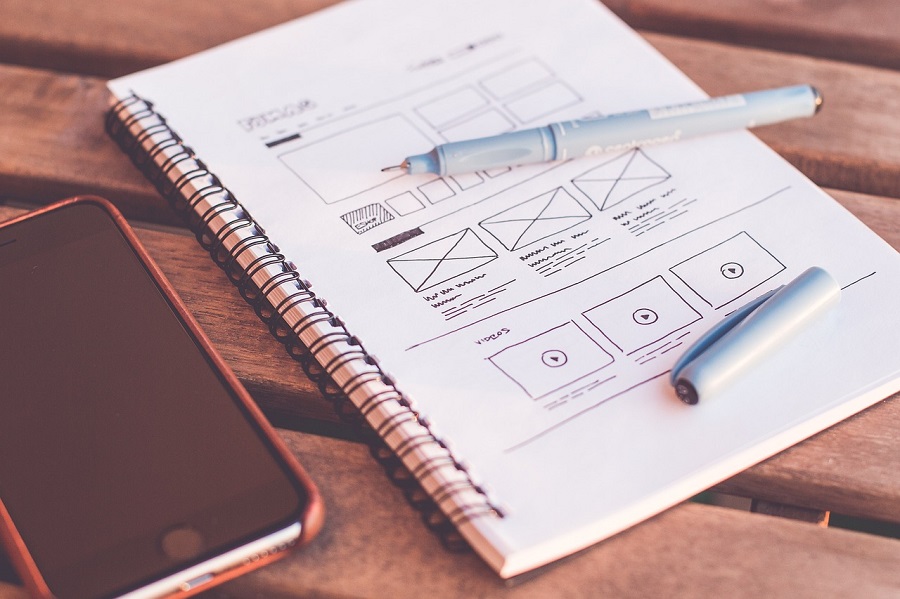
Effective design is greatly influenced by grid systems, which offer a systematic foundation for information organization. They bring order to the visual chaos, creating a harmonious balance that appeals to people. A grid ensures consistent spacing and alignment by dividing the screen into columns and rows, enhancing readability and navigation. A smooth experience is provided on both desktop computers and mobile devices thanks to grid-based layouts that adapt to different screen sizes. This adaptability is crucial for keeping readers engaged across platforms!
Grid systems aid in establishing a clear visual hierarchy, guiding people’s attention to essential elements. Images and text neatly slot into designated spaces, preventing clutter and making information easily digestible. And integrating a grid-based approach can lead to friendly designs that encourage longer visits and lower bounce rates! Therefore, embracing the power of grid systems is integral to creating a cohesive, structured, and aesthetically pleasing website.
Effective communication through balance and symmetry
Balance and symmetry strongly affect how people connect with web layouts, making things visually harmonious. When elements are evenly distributed, readers perceive a stable and organized design. This enhances readability and ease of navigation. Besides, symmetry fosters a feeling of familiarity, as our brains naturally gravitate toward balanced compositions. So, when people browse a website, symmetrical designs give them a sense of structure and comfort, boosting their trust in the authenticity of the content.
Information can be delivered easily and is easily absorbed by readers because of balance and symmetry. A unified and interesting experience is created through the seamless integration of images, text, and other components! By understanding and implementing the principles of balance and symmetry in design, you can create layouts that captivate users’ attention and provide an intuitive and enjoyable browsing journey.
White space: Enhancing clarity and focus
In web creation, white space, or negative space, matters because it enhances attention and clarity. This unoccupied area around elements gives the eyes room to breathe, allowing content to stand out prominently. Using white space effectively in web design not only improves visual appeal but also aids in guiding users’ attention to the most critical information! It minimizes distractions, preventing people from feeling overwhelmed. When content is surrounded by ample white space, it becomes more digestible and easier to comprehend. White space acts as a buffer, separating elements and contributing to a clean and organized layout. This leads to a seamless browsing experience that encourages users to explore and stay on your website longer. Understanding and using the possibilities of white space may, therefore, considerably help to create a useful and visually beautiful look that piques people’s attention and engagement.
Typography’s psychological role
Flow and readability in web creation are closely tied to the psychological impact of typography. The choice of fonts, their sizes, and spacing all influence how users engage with content. Typography affects the pace at which users absorb information, shaping the flow of their reading experience! Serif fonts can convey a sense of tradition and reliability, while sans-serif fonts often feel modern and straightforward. So, this choice can evoke certain emotions and set the tone for your content.
Moreover, proper line and paragraph spacing enhance readability, preventing users from feeling overwhelmed. A well-crafted typography hierarchy guides readers through the content, highlighting key points and maintaining their interest. Therefore, by comprehending the psychological function of font, you can craft something that resonates with readers and provides them with a cozy and pleasurable reading experience!
Color psychology
Color psychology holds substantial sway in the connection between user behavior and web layout, as different hues evoke varied emotions and associations. Warm colors like red and orange can evoke energy and urgency, making them ideal for call-to-action buttons. Cooler shades like blue and green evoke calmness and trust, fitting for financial or health-related websites. And color combos set the mood and feel of your site. For instance, contrasting colors can create visual interest, while analogous colors lend a harmonious feel. The trust and engagement customers have with your brand may change as a result of these color selections. So, choose the colors of your brand carefully! Align them with your target audience’s preferences and the message you want to convey! So, you can realistically craft a visually appealing look that appeals to consumers, entices them to explore deeper, and promotes a good brand experience by utilizing color psychology.
Consistency and cognitive load reduction
For a seamless experience, color schemes, typefaces, and buttons should all be consistent. After all, lowering the cognitive load is essential since intricate sites may overwhelm people and turn them off. Therefore, by concentrating on consistency, you reduce the mental work needed to comprehend the structure of your website. With this tactic, interaction is encouraged, and conversions are significantly more likely!
Working on your site’s psychology
Working on understanding design psychology, the intricate connection between user behavior and web layout is always beneficial. And with our guide, we are sure you’ve made a solid start! Still, don’t hesitate to look for professional help while you slowly make your own what we talked about.


